BreathableExploration 2025
Breathing exercises with personality

- Role
- Solo project
- Skills
- Figma, Rive, SwiftUI
Challenge
What would a breathing app built around emotional design principles look like?
I gave myself one month to ideate and build a functional prototype around this design challenge.
Problem
Breathing apps work - but they're also kinda boring
They are effective, well-documented, and backed by real science. Most treat the exercise as a utility: a timer with an expanding circle. Functional, but commit the sin of not only being sterile, but also forgettable.
Hypothesis
Two questions guided this exploration
Solution
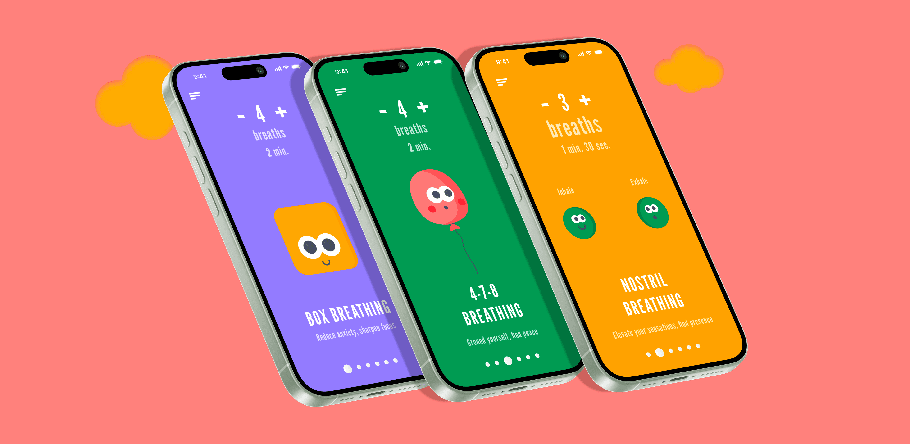
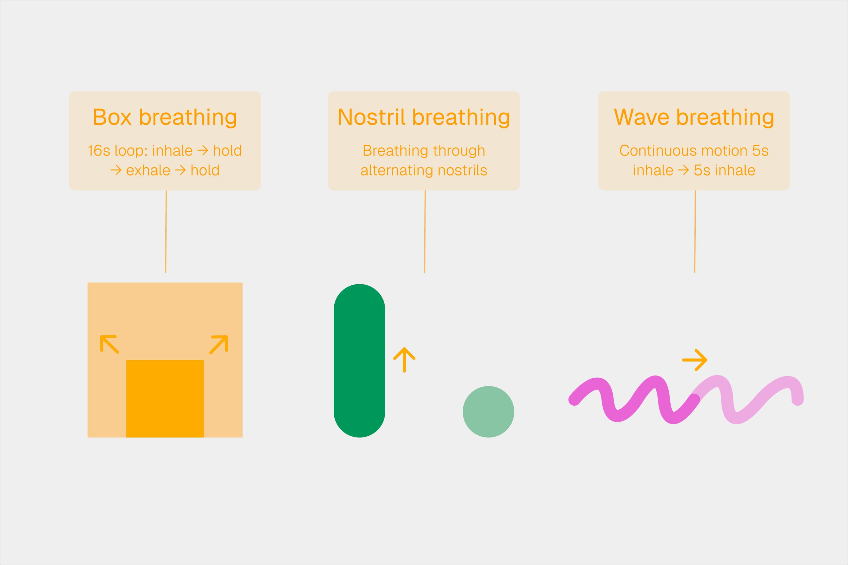
Breathable: Characters that teach by being themselves
Character-driven animation replaces abstract UI elements, presenting each breathing technique through a distinct character whose shape and motion communicate rhythm. The character becomes the instruction — and the reason you open the app again.
Initial analysis
Same shape, different label
Most competitors reuse the same expanding ring for every technique — only the timing changes.
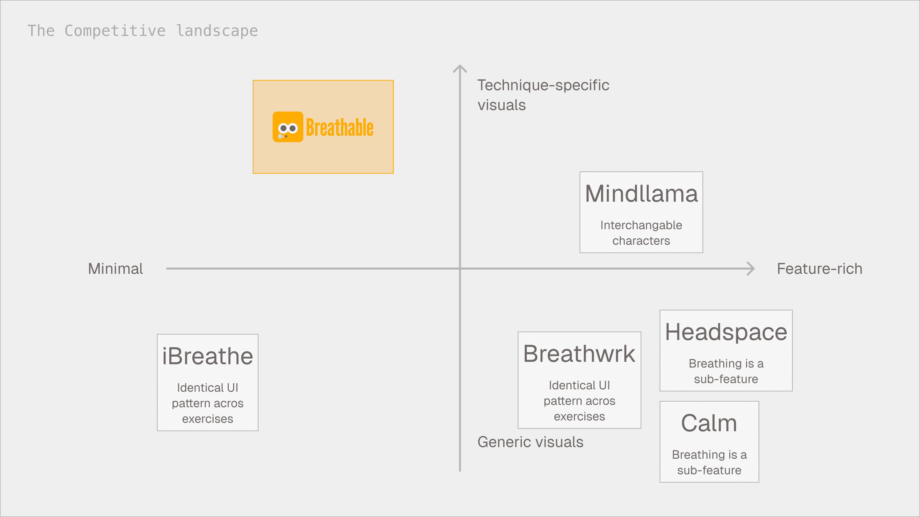
Mindllama
The exception to the rule: 40+ animated characters across 10+ breathing techniques, plus ambient sounds, focus timers, and ASMR. The character work resonates, but the characters are companions, not instructions. Swap any character onto any exercise and it works the same.
Breathwrk
100+ exercises with guided classes, streaks, lung score tracking, and Peloton integration. The most feature-complete breathing app on the market, but every exercise uses the same visual pattern. Function over feeling.
Calm & Headspace
Breathing lives inside a broader wellness platform — alongside meditation, sleep stories, and focus music. The exercises work, but they feel like a menu item, not the product.
For a tool that is meant for regulating emotions, most of the offerings are oddly void of it.
Design process
Shape teaches technique. Motion teaches timing.
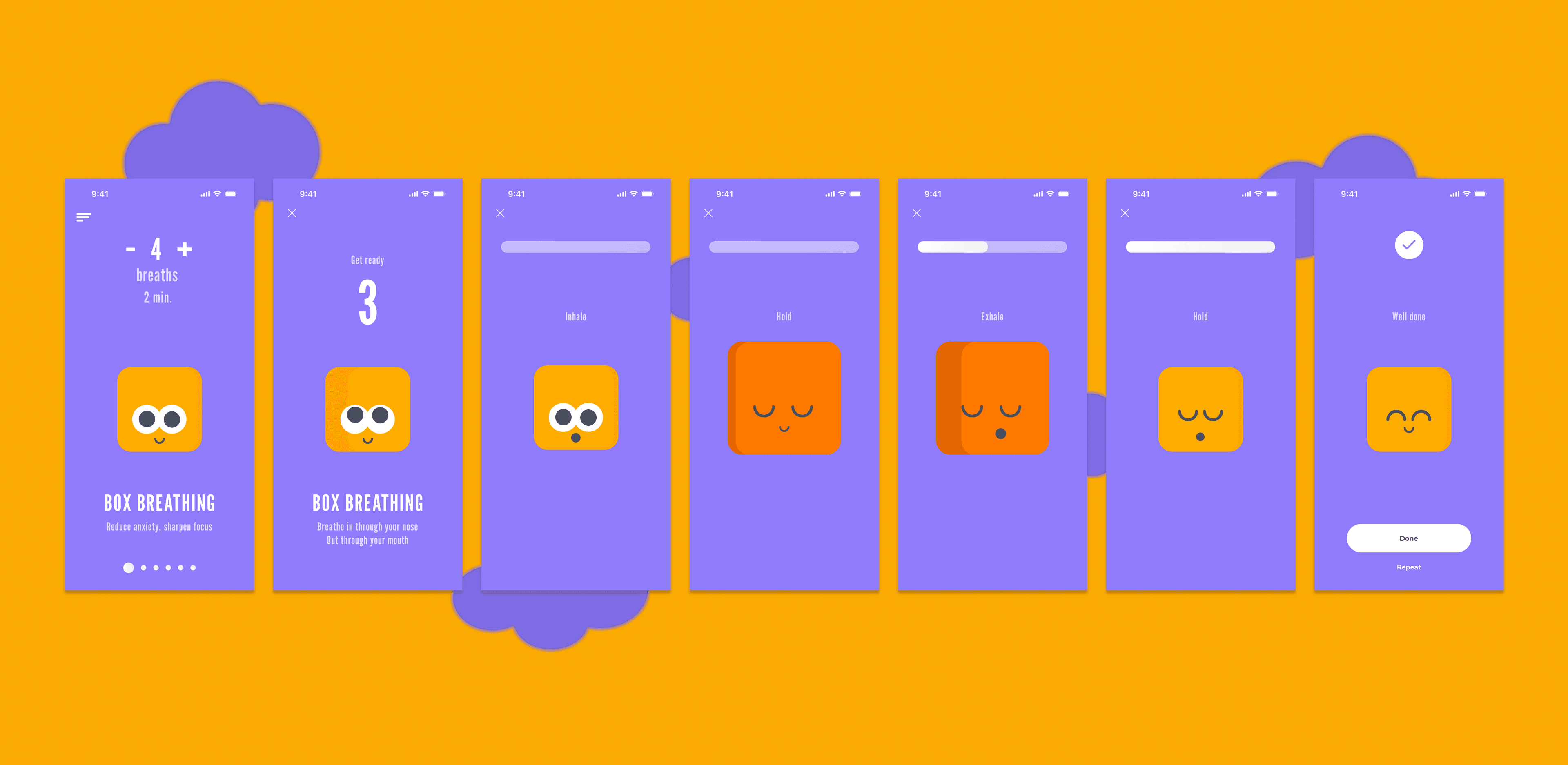
One of the most used breathing techniques, box breathing, has four equal phases: inhale, hold, exhale, hold.
Drawing a box that breathed like a box was an unlock. Each technique gets its own form. The shape becomes the instruction.
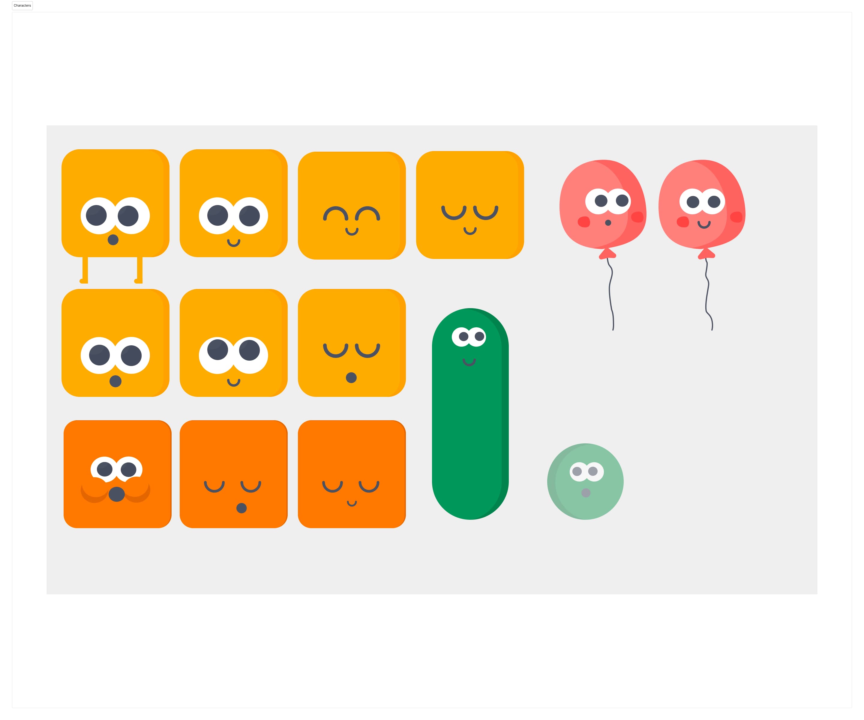
Breathing life into shapes
The shapes worked as a concept but felt mechanical. Adding subtle expressions turned feedback into feeling — eyes soften on inhale, open on exhale, barely blink during holds.
The concept proved solid in early testing: character design became an expression of the intended interaction design.
What I deliberately cut
Streaks. Badges. Session ratings. Post-session stats. Every other app in the space had at least three of these.
I don't believe that breathing apps should borrow retention mechanics from apps competing for your attention. So, I cut all of them.
What I learned
Character = interaction
Shape teaches technique. Expression communicates personality.
Less is more
No streaks, no badges, no accounts. Restraint as a design choice.
Emotional design gap
Most apps optimize for function. There is a value in creating an emotional proposition.